Ask the question you
actually have.
Every observability tool can answer “what was CPU on this host.” Almost none can
answer “why did our bill go up last week, and is it justified.” Lumi is built for the
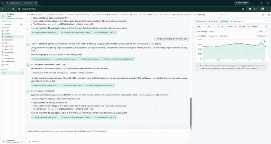
second kind of question — visual queries, live charts, anomaly and threshold alerts,
with cost sitting beside performance instead of in another console.
THE GAP

The question is in English. The tool wants a language.

Between the two sits a translation step, and that step is where most investigations stall. Not because the data is missing — because the person with the question isn’t the person who can write the query.

1

Expertise concentrates
Three people know the query language well. Every urgent question routes through them, including at 3am.

2

Cost lives somewhere else
Performance is in one console, spend is in the billing portal. Correlating them is a manual export.

3

Dashboards become a backlog
Every new view is a ticket. By the time it ships, the question has moved
on.
“Which services got more expensive this week, and did their traffic go up to match?”
HOW IT WORKS
Question in. Dashboard or alert out.
The same four steps every time, whether you typed the question or clicked your way to
it.
01 · DEFINE

Pick the metric

Search across every connected source. No memorising metric names or
namespaces.
cost · avg · 1h
02 · SHAPE
Filter and aggregate
Choose the time aggregation, the space aggregation and the grouping from
dropdowns.
group by service · all sites
03 · SEE
The chart picks itself
Percentile aggregations render as a band, grouped queries as top-N or stacked, a single series as a line.
rolling line · anomalies 1
04 · WATCH
Turn it into an alert
Set a threshold on what you’re looking at, or let anomaly detection learn the baseline
instead.
⚲ set alert
THREE MODES
Zoom out, zoom in, or get precise.
Different questions need different altitudes. All three read the same telemetry, so
moving between them never means starting over.

DASHBOARD

The standing picture
Generated views for the things you watch every day. Filters apply across the whole board, so one change re-scopes every panel.
ANSWERS
“is anything off this morning?”

PER ENTITY

One thing, in detail
A single pod, host, service, cluster or account — its metrics, its cost, its recent changes, and how it compares to its peers.
ANSWERS
“what is checkout-api doing right now?”

QUERY

Exactly what you meant
The visual builder: metric, filters, aggregations, grouping, window. Precision without syntax — and the result is one click from becoming an alert.
ANSWERS
“cost by service, p95, last 7 days”
CAPABILITIES
What’s in the box.
⌕
Visual query builder
Metric, filters, time and space aggregation, grouping and window — all from dropdowns.
〰
Live time-series charting
Real-time rendering with zoom, pan and comparison against the previous window.
▤
Smart chart selection
The chart kind follows from the query: bands for percentiles, top-N for groups, lines for single series.
⚠
Anomaly detection
Statistical deviation from learned behaviour — catches problems that never cross a fixed limit.
⏱
Threshold alerting
Rule-based alerts for known operating limits, set directly from the chart you’re looking at.
$
FinOps telemetry
Spend analysed by service, cluster, tenant, team, environment or resource, beside the performance data.
◎
Per-entity & grouped views
Inspect one host or service, then roll up to the cluster, team or region it belongs to.
◷
Time-windowed analysis
Rolling or fixed windows, compared against history and correlated with deploys.
◈
Coworker
Ask in plain language, get the query built and the answer explained — with the reasoning shown, not hidden.
⧉
Saved & shared views
Pin a query as a named view so the next person starts where you finished.
☰
Cross-source metrics
Prometheus, Datadog, CloudWatch and native telemetry searched from one field.
⑂
Cross-environment
One experience across AWS, Azure and Google Cloud instead of three separate consoles.
WHAT’S DIFFERENT
Where Lumi takes a different line.
The observability market is mature and the incumbents are good. These are the specific
places where Lumi’s approach diverges — not a claim to be better at everything.
DIMENSION
THE USUAL APPROACH
LUMI'S APPROACH
Getting to an answer
A query language — PromQL, NRQL, DQL, SPL — learned well by a few people on the team.
A visual builder anyone on the rota can drive, with plain-language input as the front door.
Choosing a chart
Many chart types available; the user picks and configures the right one.
Selected from the query — the shape of the data decides the shape of the chart.
Cost and performance
Usually separate products or consoles; correlation is a manual export.
Same surface — spend sits beside utilisation, filtered by the same dimensions.
Building a view
Dashboard engineering: panels defined, maintained and version-controlled by a platform team.
Generated on request, then pinned and shared if it turns out to be worth keeping.
Multiple clouds
Native tooling is excellent per-cloud, and separate per-cloud.
One experience spanning AWS, Azure and Google Cloud.
WHAT CHANGES
The difference shows up in the
numbers.
Not in a slide. In how long an investigation takes, how much of the telemetry bill you can
explain, and how often a problem finds you before a customer does.
TIME TO FIRST ANSWER
20+ min writing queries
under 60s
Pick the metric, filter, aggregate. The chart builds itself.
WHO CAN INVESTIGATE
the 3 who know the language
the whole rota
Visual queries remove the syntax barrier entirely.
SPEND YOU CAN EXPLAIN
one cloud invoice
per service & team
Cost attributed to the workload that consumed it.
PROBLEMS CAUGHT EARLY
threshold breaches only
deviations too
Anomaly detection catches what no static limit would flag.
👤
For the operator
DAY TO DAY
✓
Ask the question you actually have
“Why did checkout latency move at 14:00?” is a query here, not a research project.
✓
Stop rebuilding the same search
Pin a view once and the next person on-call starts where you left
off.
✓
Cost in the same breath as performance
Answer “is this worth what it costs” without leaving the
investigation.
✓
Alerts that carry context
The signal arrives with the chart, the baseline and the related changes attached.
◈
For the organization
ON THE BALANCE SHEET
✓
Observability stops being a specialist skill
Query expertise held by a few people is a bottleneck exactly when it matters most.
✓
Telemetry spend becomes defensible
Cost per service and per team is a number finance recognises — and can act on.
✓
Less time building dashboards
Engineering hours go to the product instead of maintaining panel definitions.
✓
Shorter incidents
Faster investigation compounds into lower MTTR and fewer customer-visible minutes.
Figures are illustrative and depend on your signal volume, existing tooling and current query workflow.
SCOPE
What this is, and what it isn’t.

Worth being direct about, because the wrong expectation is a worse outcome than a
narrow one.

✓
For the operatorLumi Telemetry is
—

Lumi Telemetry is no

Get started
Telemetry analysis,
made conversational
From an operational question to a dashboard, an anomaly or an alert —
without deep query expertise in between.
Autonomous ITOps platform powered by an AI Coworker, SRE Orchestrator, and Agent Builder
© 2026 – 2027 LumiOps.AI. All rights reserved.

© 2026 – 2027 LumiOps.AI. All rights reserved.